
UX / Product Design — Case Study
Designing for enterprise facility management
Archibus is a comprehensive Integrated Workplace Management System that has been evolving since the 1980s, accumulating decades of functionality across real estate, space planning, maintenance operations, asset tracking, and environmental compliance. Its long history created a platform with immense depth as well as the technical constraints typical of mature enterprise systems. During my seven years on the product team, I focused on making this powerful tool feel more user‑friendly and modern—designing clear and visually appealing dashboards, improving multi‑level information architecture, conducting user research, and driving UI modernization efforts across the application.
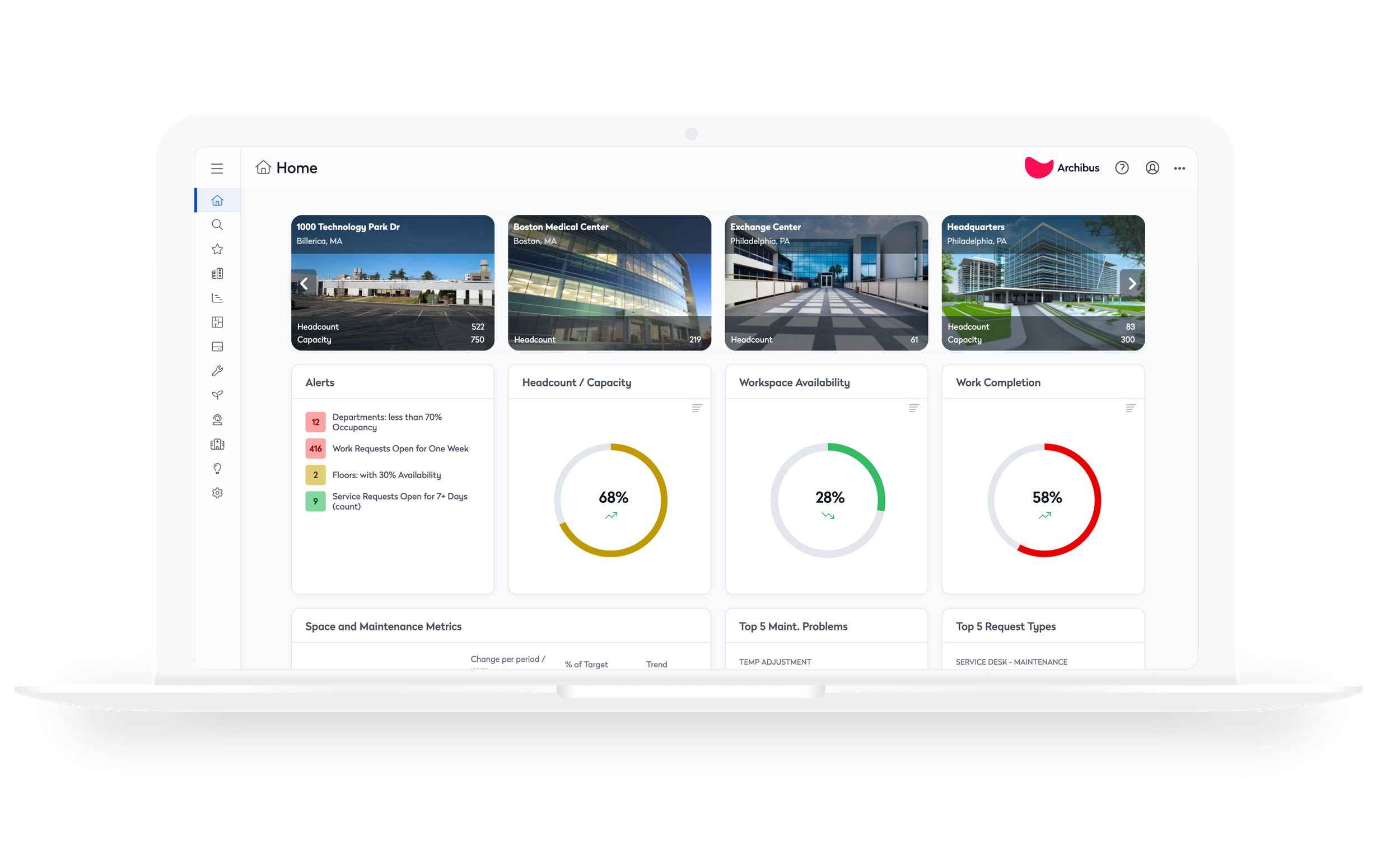
The WebCentral homepage gives portfolio managers a real-time view of occupancy, space utilization, and operational performance across their building portfolio, helping them identify opportunities and prioritize action.
Faster, more fluid navigation
The existing sidebar had to support 2,000+ tasks spread across four layers of hierarchy—powerful, but overwhelming. We introduced a progressive disclosure model that highlights the most relevant shortcuts first, giving users a clear starting point. For deeper exploration, the full task list remains accessible on demand. This approach significantly reduced cognitive overload and made high‑value tasks easier to find.
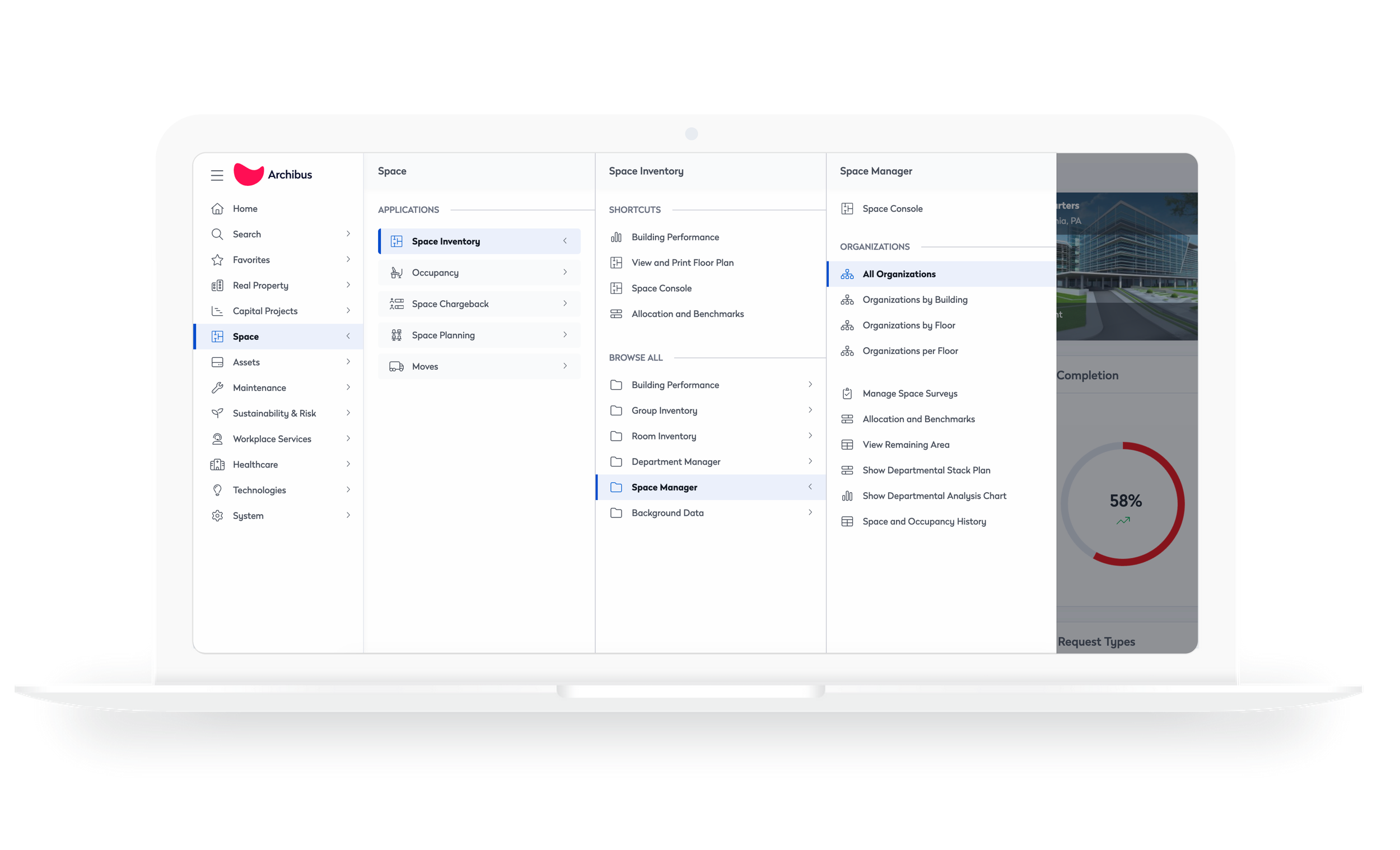
Expandable drawers apply progressive disclosure to a complex task library, revealing information only when needed and reducing the cognitive effort required to find the right action.
Elevating legacy UI through design + front‑end craft
One of my key areas of focus was the Space Console, the primary interface space administrators use to view floorplans, assign occupants, understand space categorization, track department allocations, and identify available space. I improved the UI to make dense spatial information easier to scan, created custom iconography to support clearer visual cues, and resolved numerous CSS and front‑end issues—work that drew directly on my background as a developer and strengthened the overall visual quality of the experience.
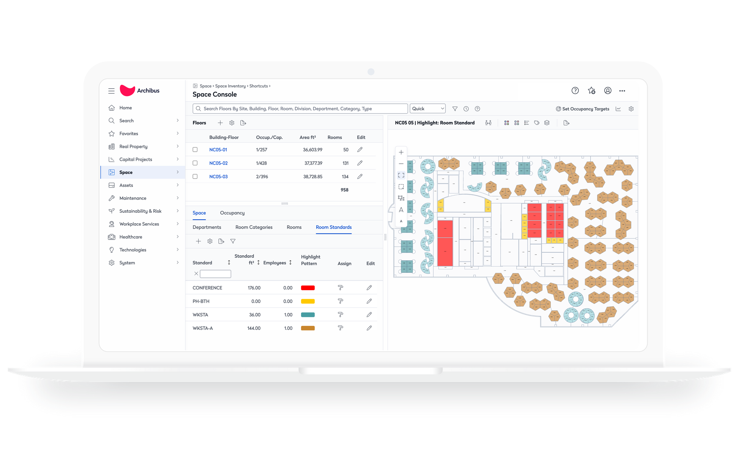
The redesign replaced dated UI patterns with a more cohesive visual system, improving clarity while preserving the powerful capabilities of the Space Console.
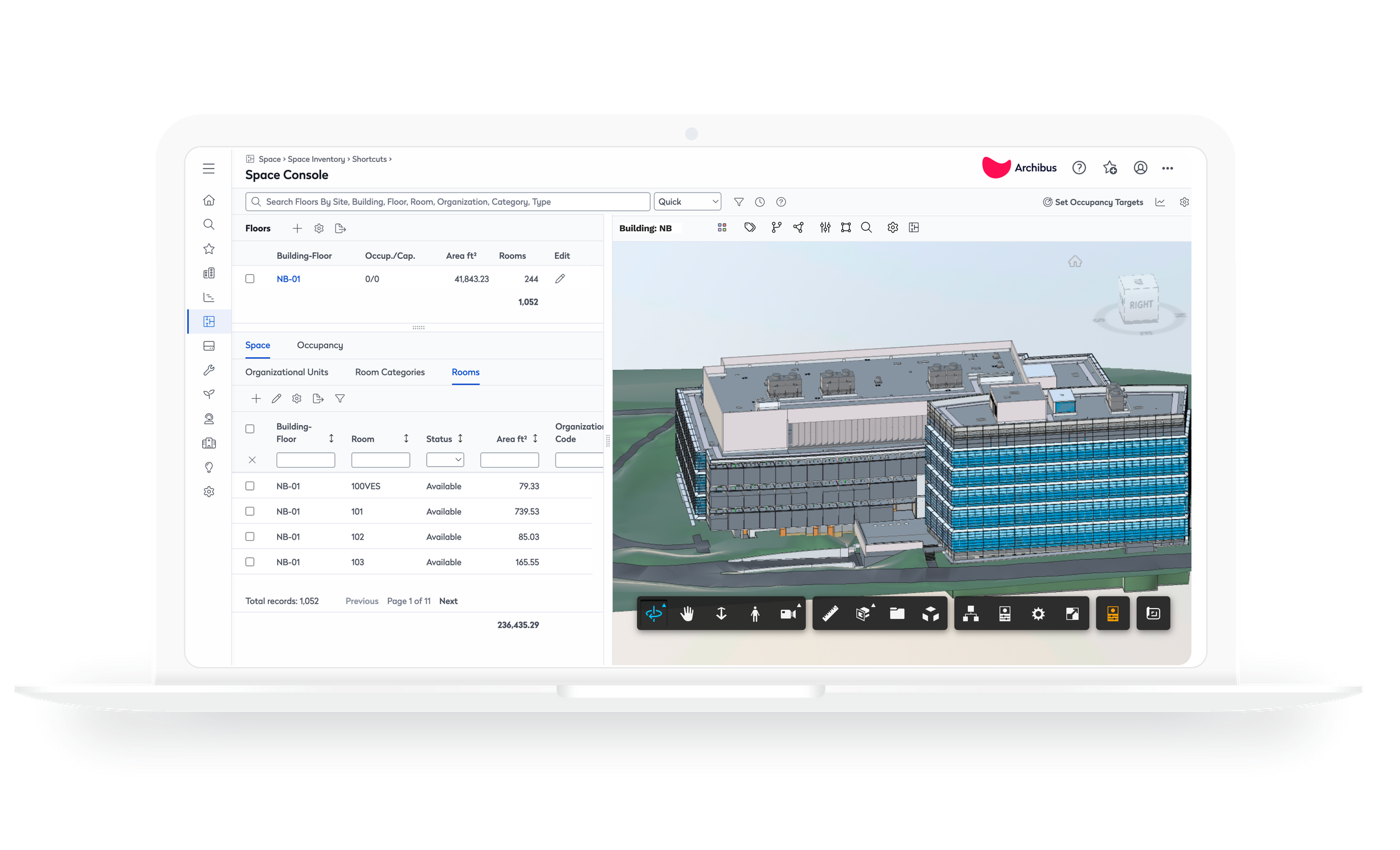
The 3D building model helps facilities teams visualize the physical environment behind their space data, supporting planning, maintenance, and operational decisions.
Bringing Archibus into the Evo design system
I adapted the legacy Archibus component library to align with the Eptura Evo design system, translating older UI patterns into a modern, unified visual language. By updating typography, spacing, color, and component styling to match Evo standards, the interface immediately felt more cohesive and contemporary. This alignment reduced long‑standing design drift and brought Archibus into visual consistency with the rest of Eptura’s ecosystem, refreshing the product without requiring a full rebuild.
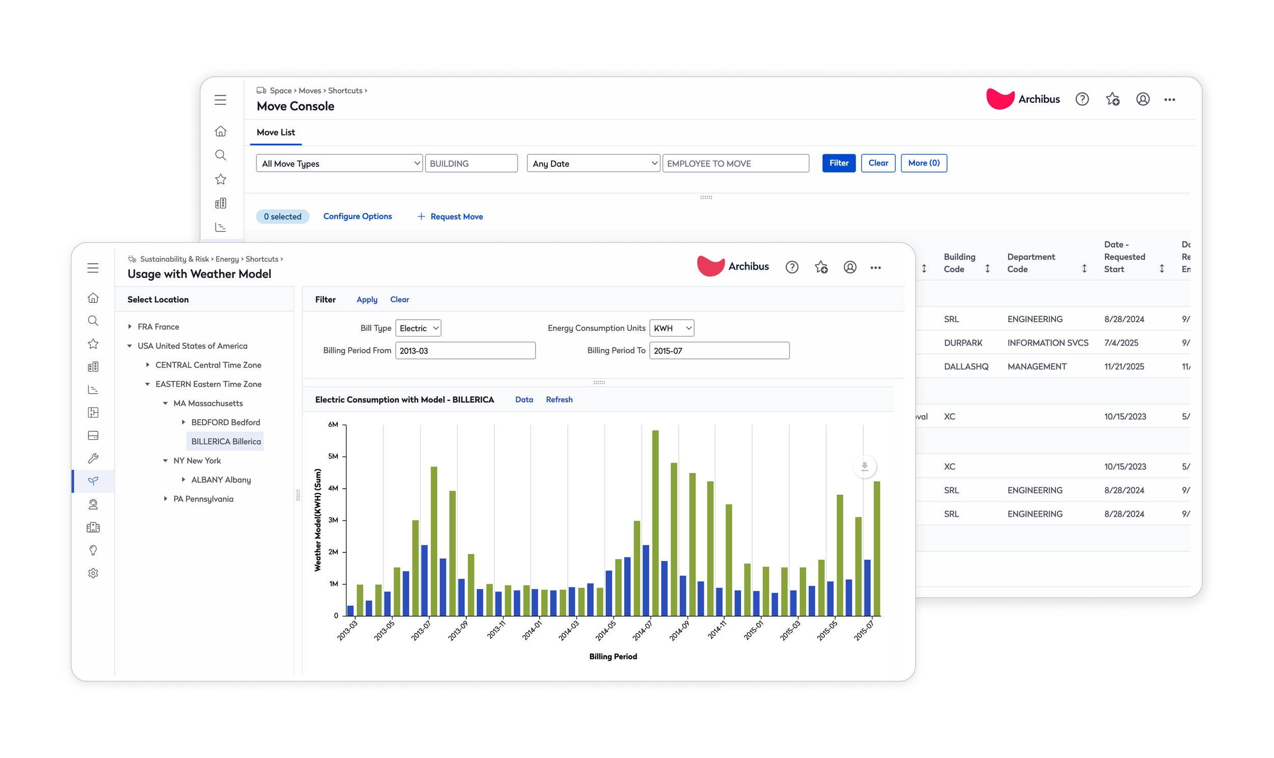
A lighter visual language, consistent spacing, and clear section boundaries make dense operational data easier to navigate without sacrificing depth or functionality.