Workplace Floorplan Visualization
Designing clarity in a data‑dense world
Space planners rely on the Space Viewer to make high‑stakes decisions about seating, allocations, and workplace strategy. The challenge is that every seat on a floorplan carries multiple layers of meaning—seating function, occupant assignment, org‑unit allocation, capacity, neighborhoods, and even temporary move‑group metadata. Visualizing all of this simultaneously without overwhelming the user required a careful balance of density and clarity. My goal was to create a visual system that allowed planners to scan a floorplan at a glance, understand its operational state, and make confident decisions—without sacrificing visual harmony or accessibility.
Labels that stay legible at any scale
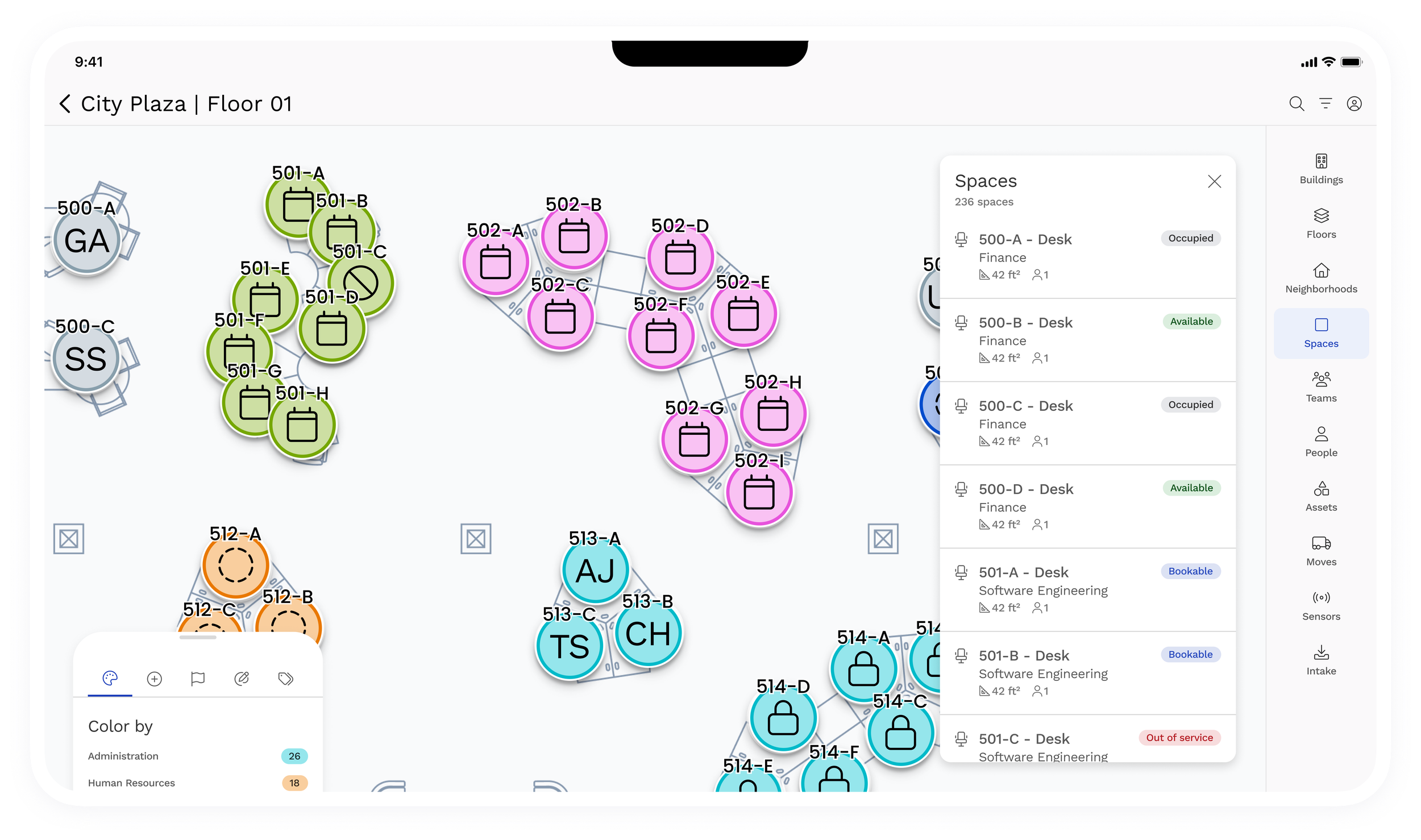
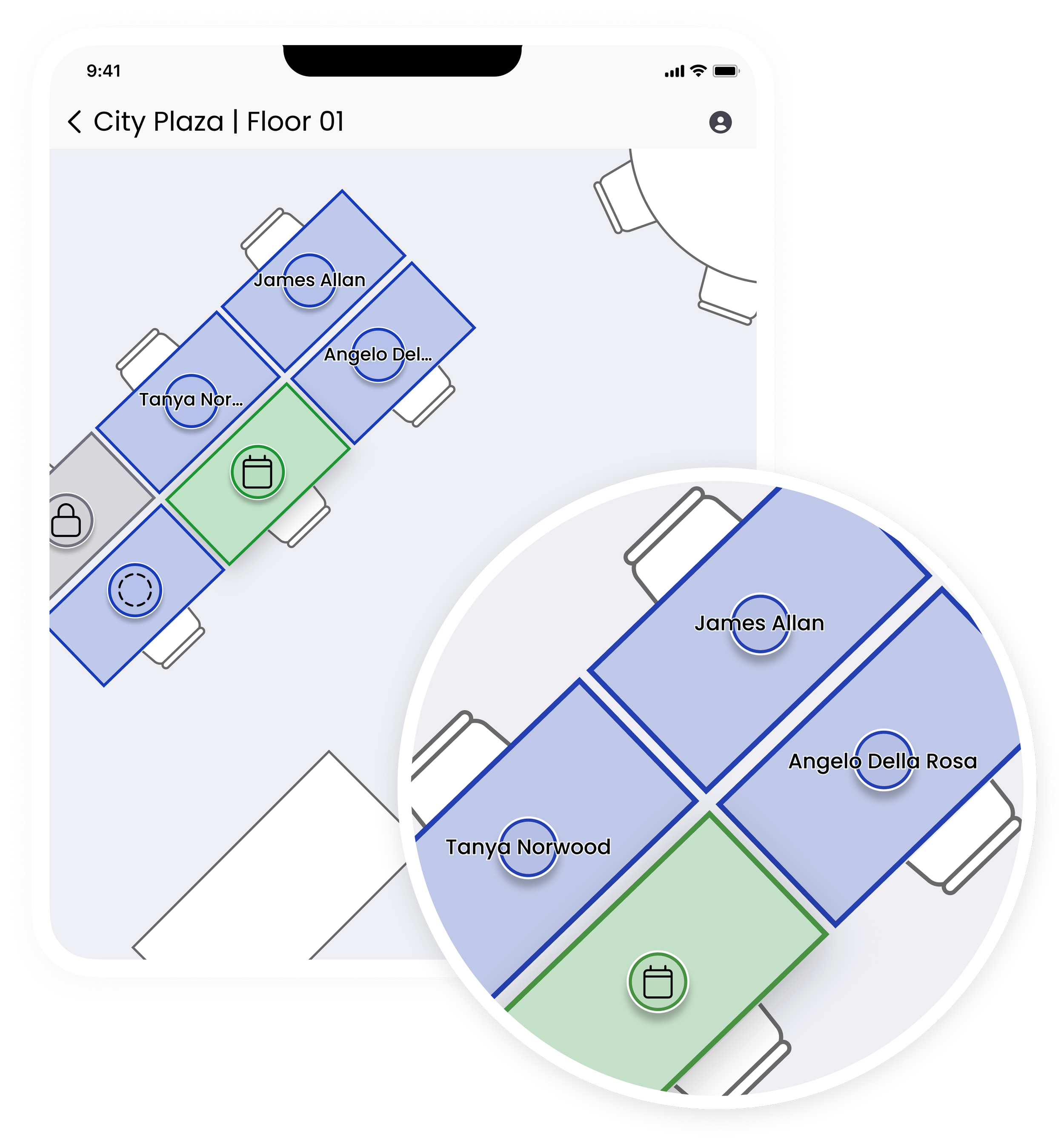
One of the most persistent issues in floorplan visualization is label overlap, especially when users zoom out to see the broader spatial context. Planners want labels visible at all times because hovering over each asset slows down their workflow. To solve this, I designed an adaptive labeling pattern that fits within a typical seat footprint and intelligently truncates when names exceed available width. This approach preserved scannability while preventing collisions between adjacent labels. The result was a labeling system that remained readable, stable, and unobtrusive across all zoom levels—supporting the planner’s natural scan‑first behavior without introducing clutter.
A multi‑signal marker for modern space planning
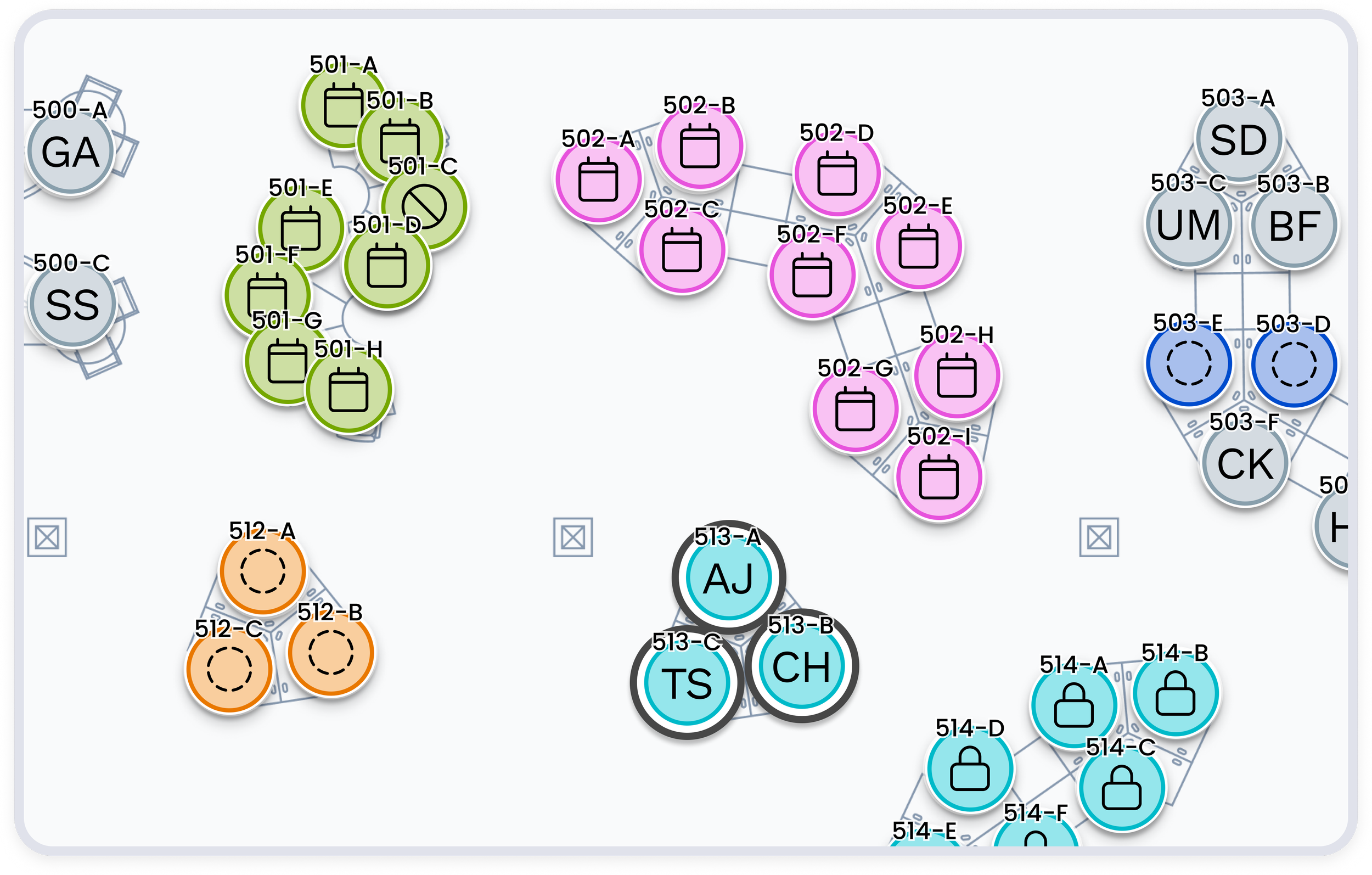
To reduce the visual noise created by multi‑colored room fills and borders, I introduced a multi‑signal circular marker capable of conveying up to four pieces of information at once. Each marker combines an icon or occupant initials, a background color, labels and an optional highlight ring—allowing planners to see space function, occupancy status, allocation, and user‑selected metadata in a single compact element. I designed the system to meet WCAG 2.1 AA contrast requirements, ensuring icons and initials maintain a 4.5:1 ratio against any background. This marker system replaced a chaotic color model with a clean, scalable visual language that communicates more while showing less.